SIMPLE FINANCE
Jan 2018-May 2018
SIMPLE FINANCE
Jan 2018-May 2018
SIMPLE FINANCE
Jan 2018-May 2018
SIMPLE FINANCE
Jan 2018-May 2018
SIMPLE FINANCE
Jan 2018-May 2018
1-2-3 Device Redesign
The 1-2-3 device was developed with the goal of helping cancer patients reduce infection and better manage their physical activity and hygiene. While the first version of the device helped to automate this patient goal, there were many opportunities to make improvements and enhance the overall experience. My team was tasked with evaluating obstacles presented by the previous device and challenged to develop a new version with improved experience.
When: May 2019 - April 2020
For: Cincinnati Children's Hospital Cancer/Blood Diseases & Bone Marrow Transplant
Role: UX Design Fellow & Product Interface Design Lead
What Is The 1-2-3 Device?
The 1-2-3 initiative was developed in an effort to reduce infection rates and help patients manage their own physical activity and hygiene. This project was founded from a nurse-backed incentivized program that awarded stickers to patients who completed three activities of daily living (ADL’s). These ADL’s include bathing once, doing physical activity twice, and doing oral care three times hence the naming of the 1-2-3 Device. Stickers were exchanged for “BMT Bucks” which could be used to buy toys from Child Life.
The 1.0 device was developed to help automate this process for Bone Marrow Transplant (BMT) and Cancer/Blood Disease (CBDI) patients. Patients use the device to log these activities and keep track of points awarded for completion. RFID cards are swiped by patients for logging activities of daily living, and parents and nurses use their RFID cards to verify points.
OVERVIEW
Defining The Problem
While the 1.0 device improved on overall patient adherence, it was difficult and time consuming for nurses to manage, lacked a deeper sense of patient motivation, was difficult to upkeep, and required more advanced functionality and hardware.
OVERVIEW
The 1.0 Device

The 1.0 device with family/caregiver RFID card before the improvements and redesign.
OVERVIEW
Project Goals
Understand experiential deficiencies of the 1.0 device from various stakeholder's perspectives (family, staff, patients).
Identify the potential opportunities for device improvement.
Develop a deeper understanding of what motivates patients to increase compliance.
Design a V 2.0 with improved interaction, usability, and experience.
RESEARCH
Research Methods
Literature Review: Articles were gathered by the team to understand and create a basic knowledge about health home care systems.
Benchmarking/Historical Review: To further understand The 123 Device, the team looked at previous project work and benchmarked similarly performing devices and applicable features.
Interviews: The team had one-on-one interviews with various stakeholders to gather insights about the current device deficiencies and future needs.


Early research and concept development
RESEARCH
In-depth Interviews
CCH Technical Leads
CCH Project Managers
CCH Clinical Research Coordinators
CCH Nurses
Patients & Parents/ Caregivers
RESEARCH
Stakeholder Map
A stakeholder map was developed to better understand the interactions and roles each stakeholder plays during a patient's time at the hospital. This process helped the team to better incorporate what type of interactions and needs each stakeholder might expect for the updated device.

RESEARCH
Stakeholder Personas
RESEARCH
1.0 Device Interaction Map
This map outlines every daily expected interaction with the 1.0 device as well as the pain points and opportunities areas for improvement. We learned that the 1.0 device requires far too much redundant interaction for nurses and families to maintain, which often left patients waiting for point gratification.

IDEATION
1.0 Device Opportunities
Nurse Workload
-
Nurses are often understaffed, work irregular hours, and extremely busy; making it difficult for them to remember to interact with the device and authorize points.
-
Nurses are more focused on procedure, so the device is considered low priority in their eyes.
Patient Motivation
-
With a wider range of ages admitted to the hospital (babies to 20’s), motivation differs greatly.
-
Being motivated by an extrinsic system of exchanging points for prizes is not actually very effective since patients are consistently getting toys during their stay anyway.
-
Interaction with the device is redundant with little immediate payoff.
System Upkeep
-
The prize management significantly increases workload for staff.
-
Swiping the RFID cards is burdensome due to cost, connection issues, and constant swiping.
Function & Hardware
-
Overtime, the interaction with the device loses its appeal and novelty, and becomes forgotten.
-
Parents and nursing staff are more concerned with the overall trend of how patients are performing rather than the day-to-day details.
-
No way to access any kind of data summary to track decline or improvement.
-
Current design limits adherence to only the three core activities.
-
Interface graphics require continual replacement due to constant disinfection.
IDEATION
2.0 Device Goal Criteria & Themes
Based on the research phase, the team identified theme and criteria goals for the 2.0 device that were laking or not present in the 1.0 device. Theme goals were comprised of the central topics we wanted to consider throughout the ideation process and criteria goals included the principle functions we wanted to incorporate.
IDEATION
Wireframing

IDEATION
First Draft Design & Testing


First Draft Testing Results: The avatar concept was originally proposed by nurses so it was well received when testing with staff; however when testing with older patients (teens), they felt it was too childish for them. While younger children would use the avatar, we didn’t want to alienate older patients who could benefit from the device. The goal going into a second draft was to refine the less intuitive interactions and develop a new UI that appeals to a wider age range of children.
IDEATION
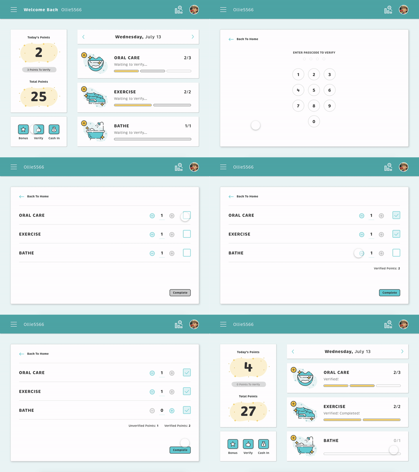
Second Draft Design & Testing


Second Draft Testing Results: The second draft UI was far better received in its inclusivity to a wider range of ages. While overall usability was successful, there were mainly issues with the overall concept of verifying points. We learned that nurses felt that being part of the verification process was unnecessary due to their already large workload. We also discovered that not every child has a consistent family member to take part in validating points. Nurse and family members were really mostly concerned about the patient's overall adherence trend rather than the patients day-to-day interactions.
REFINEMENT
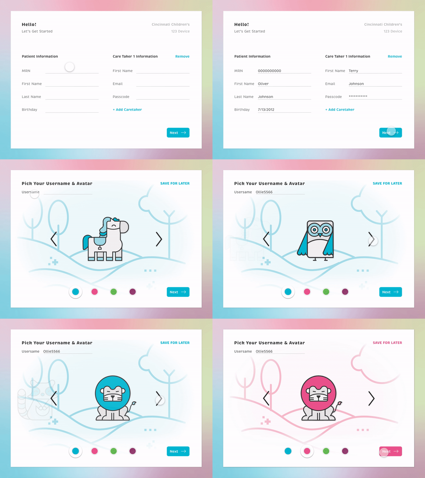
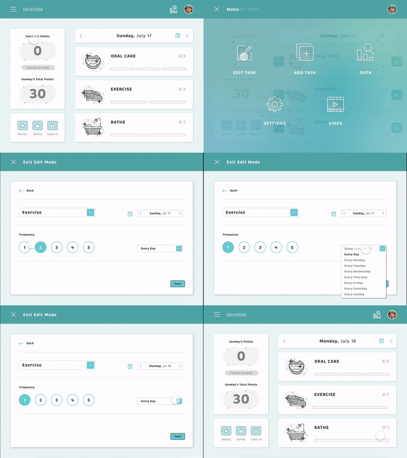
Updated Activity Entry & Editing
Removal of the verification step made the activity entry process more intuitive and eliminated the burden of relying on nurses and family members to verify points. Editing of ADL tasks allowed for more customization in regards to fluctuating patient needs within their journey.


REFINEMENT
Updated Data Visualization
Based on feedback, it was determined that the data visualization needed to focus on giving staff and family quick visual feedback on which individual ADL tasks patients were easily completing and which tasks were a struggle. It also needed to offer a data visualization on the overall success progress trends for the week and month. Ideally this feedback would give staff and family a way to see a correlation in how each step of the patient journey affects compliance, and then begin a conversation on how to make improvements.

CONCLUSION
My Role and Responsibilities
-
Formed project goals
-
Conducted stakeholder research
-
Developed and designed personas and patient journey map
-
Identified device opportunities
-
Designed wireframes
-
Independently developed the UI styles for the final designs
-
Led majority of the design for the device interface and formatting of device UX
-
Conducted usability testing with nursing staff and patients
-
Presented findings to key stakeholders and client directors
CONCLUSION
Key Learnings and Reflection
In this project I developed a deeper appreciation for the value of user testing. The target group consisted of children, parents, and nursing staff, so there was a wide range of ages, needs, and education levels to consider during the design process. Due to the variation of user conditions, it was important for me to let the testing results and feedback guide my design decisions. One example of how user testing helped in developing a more valuable product was how the insights the team gathered from nurses became a big influence on the outcome of the data visualization. In the early stages of the project, I assumed nurses would want to be very involved and would appreciate a more detailed and comprehensive data history of the patient progress. However, after testing a few concepts with nurses, they expressed that they had very little time to interact with the device and they were more interested in visually obvious and quick to understand data feedback. Based on this information, I designed the data feedback screen to give nurses more of a data overview of where patients were succeeding or declining as well as a visualization of the progress trends for the week and month.
Project Team
-
Kellen Crosby: Biomedical Engineering Co-op (1 full-time semester, 2 part-time semesters)
-
Vrinda Trivedi: Graduate Co-op (1 full-time semester, 1 part-time semester)
-
Emmanuel Jokotoye: Computer Engineering Co-op (1 full-time semester, 1 part-time semester)
-
Jay Hayne: Design Fellow (1 full-time semester)
-
Alex Vago: Industrial Design Co-op (1 full-time semester)
-
Ryan Norton: Graduate Co-op (1 part-time semester)


